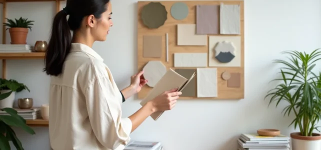
Arranging and decorating a home involves organizing a set of technical constraints (volumes, light, circulation) before choosing colors or furniture. A successful layout relies on understanding the room itself: its dimensions, openings, and orientation. The rest, the style, the palette, the furniture, follows from that.
Biophilic design in residential spaces: when plants structure interior decoration
Biophilic design refers to the structured integration of plants, natural light, and mineral textures into a living space. Long confined to offices and hotel lobbies, this principle is now making its way into private homes for reasons related to psychological well-being and stress reduction.
In practical terms, this translates into specific layout choices. A wall of climbing plants on an interior trellis replaces traditional wallpaper. A south-facing glass partition serves both as a room divider and a light source for a reading nook. Planters integrated into the kitchen countertop extend the outdoor garden.
The appeal of this approach to home decoration lies in its coherence: it imposes a palette (greens, beiges, raw wood, stone) and a range of materials that simplify subsequent choices. Rather than starting from a trendy color, one begins with a relationship to the living, and the style follows from that. To explore other decorative approaches applied room by room, all the homes on Buzzorama provide a useful overview.
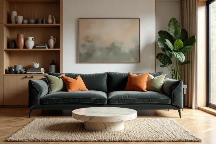
Multipurpose spaces and transformable furniture: designing a living room that also serves as an office
The widespread adoption of remote work has changed the very function of the living room. A living area that accommodates a workspace for several hours a day can no longer be thought of solely as a relaxation space. The demand for modular rooms and transformable furniture has increased since the pandemic.
The basic principle is visual separation without physical partitioning. An open low shelf, a thick linen curtain, or a double-sided piece of furniture (bookshelf on the living room side, workspace on the office side) is enough to create two zones within the same volume.
Criteria for choosing multifunctional furniture
- The depth of the surface: a foldable desk integrated into a storage unit must offer at least the depth of an open laptop without encroaching on the living room’s circulation
- The weight and ease of transformation: a convertible sofa that is never unfolded because the mechanism is cumbersome does not fulfill its purpose. Testing the action before purchase avoids regrets
- The visual coherence: a folding desk in black metal in a light oak living room creates a break. Choosing a common material (wood, metal, fabric) between the two zones unifies the space
A successful multipurpose space can visually close off in five minutes. In the evening, the office disappears, and the living room reclaims its rights. This ability for quick transformation is the true criterion for the success of a living room-office layout.
Sustainable and refurbished materials: decorating without constant renewal
Home decoration has long operated in short cycles: one trend replaces another, cushions, lighting, and sometimes flooring are changed. Recent sector analyses indicate a clear shift towards recycled materials, refurbished furniture, and low-energy lighting, driven by rising energy costs and environmental regulations.
In practice, this changes the way one builds their interior. Instead of ordering a new sideboard, one restores a second-hand piece. A natural stone top replaces laminate because it ages better over ten years. Mineral finishes (lime, tadelakt, earthen plaster) are making a comeback as alternatives to polished concrete, offering similar textures but superior durability and a more favorable ecological footprint.
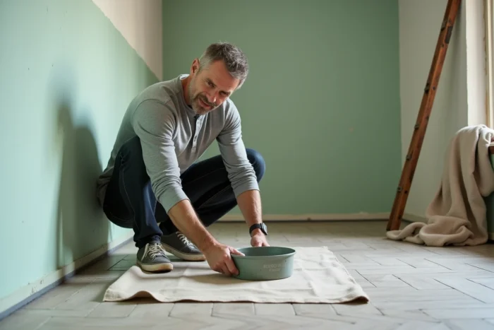
Mineral finishes: an alternative to polished concrete for floors and walls
Polished concrete has dominated interior decor for years. Its limitations are well-known: cracking on unstable substrates, sensitivity to acidic stains in the kitchen, regular maintenance of the surface treatment.
Lime or raw earth-based plasters offer a comparable visual finish (smooth surface, mineral hues) with better moisture tolerance in wet areas. Tadelakt naturally resists water without additional waterproofing treatment, making it suitable for a bathroom or kitchen backsplash.
Color palette by room: adapting shades to the function of the space
Choosing a color for a room is not just a matter of taste. The orientation of the room, its size, and its function impose constraints.
- A southeast-facing bedroom receives cold light in the morning: warm shades (terracotta, ochre yellow, rosy beige) compensate for this coldness and make waking up gentler
- A dimly lit north-facing living room appears more spacious with light, matte walls that diffuse light instead of absorbing it. Off-white or pearl gray works better than pure white, which is often too cold without direct sunlight
- An open kitchen that shares the same chromatic base as the living room benefits from a different accent (colored backsplash, contrasting pendants) to mark the transition without partitioning
- The bathroom can handle bolder shades (sage green, deep blue) because the time spent there is short and saturated colors work well in small volumes
A common pitfall is choosing the color on a screen or a small sample. The same shade appears more intense on a three-meter wall than on a five-centimeter square. Painting a test wall before ordering the necessary liters remains the most reliable method.
A lasting home layout relies on both technical and aesthetic choices. The style comes after understanding the volume, light, and actual use of each room. A well-placed piece of furniture in a well-lit room does not need to follow trends to function well.